Nilit is an international manufacturer of nylon fibers based in Migdal HaEmek, Israel.
I was asked to design a BI model that displayed the operational data of the company, so its participants could evaluate its status at any time. The model I arrived at was a mash-up of the QlikSense Associative engine, HTML, CSS, Java, and a few other tweaks.
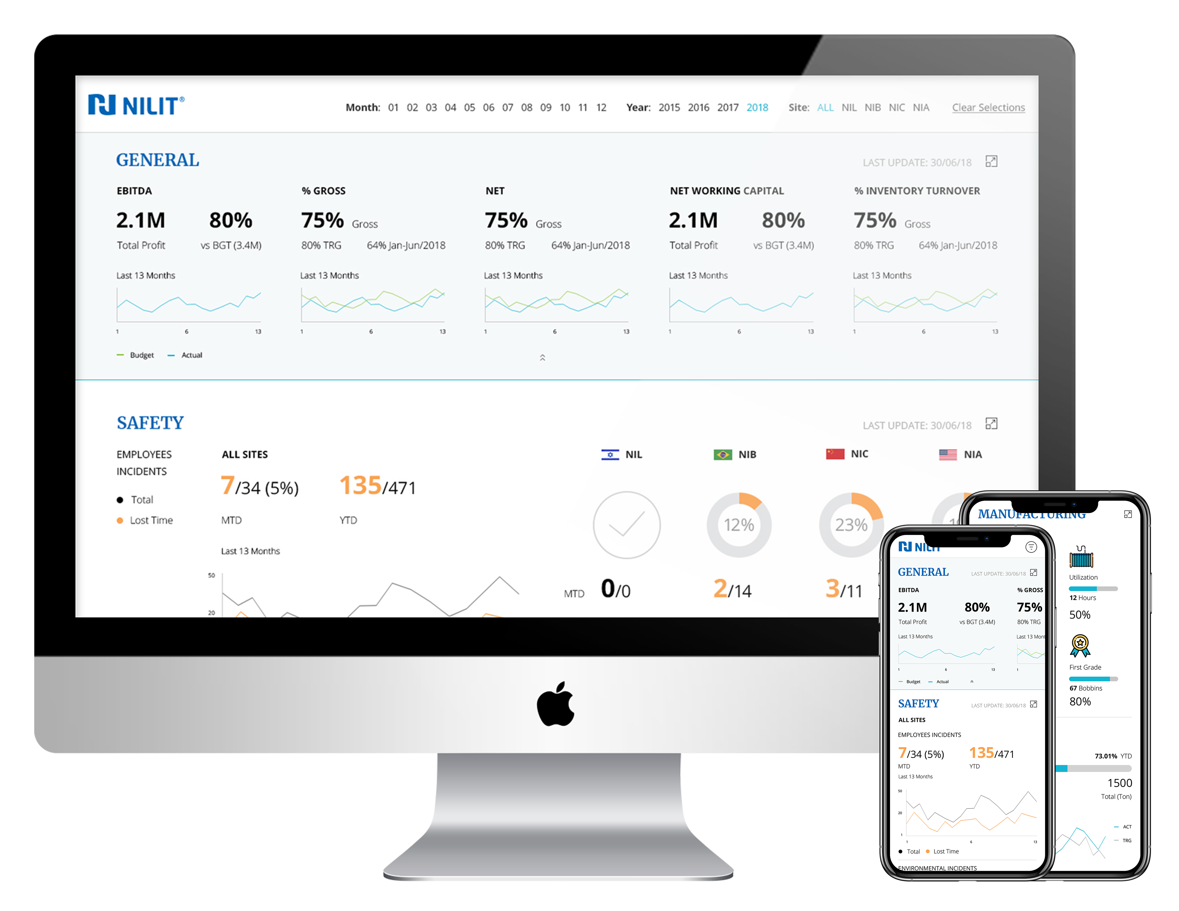
The request was initially to design to one platform, with other platform potentials in mind. For instance, the client eventually decided they were also interested in a mobile version.
The best thing about design sketches is that they save time and money. In this project my sketches were very productive, because during the process of viewing them the client identified new needs and requests. This client was more dynamic than others, and for this reason we had to accept that our next sketch might be entirely different from the prior one. With user needs changing with every sketch, we had to keep an eye on work-flow; we needed to keep it reasonable and logical, even after the the design had been updated.
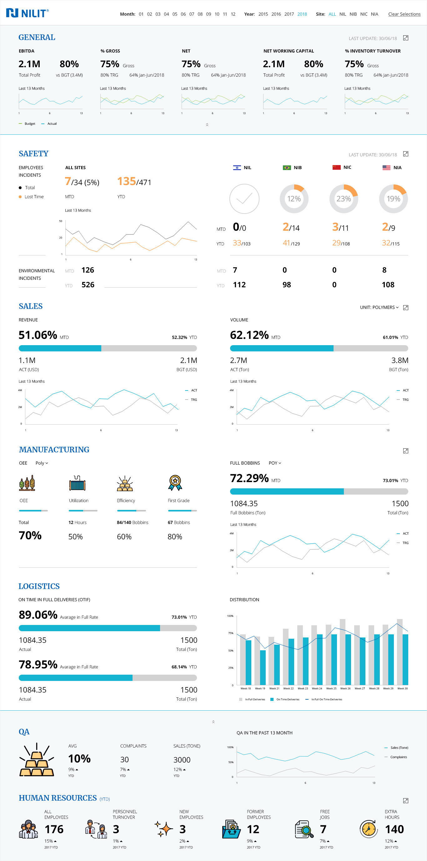
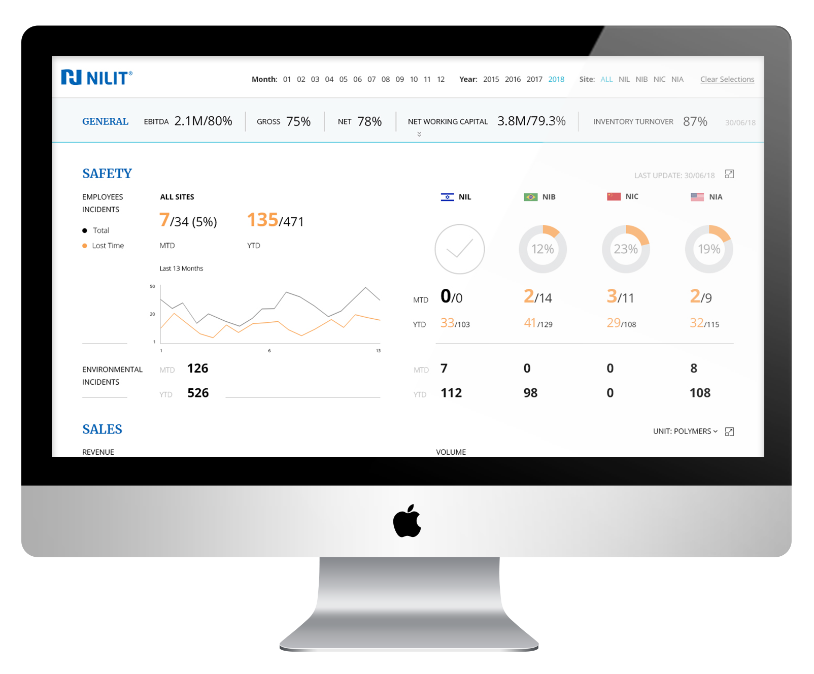
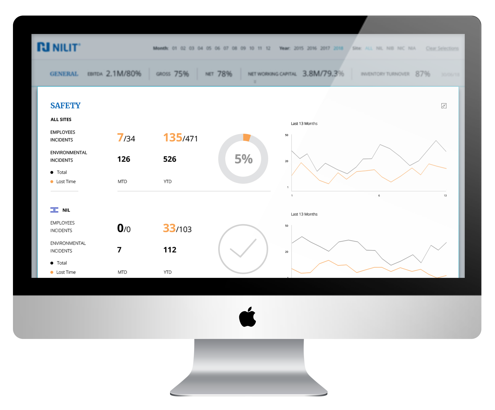
We started the project with a meeting and an Excel table that laid out loads of requirements and information we had to figure out and translate into graphic objects. The first noticeable bottleneck was that we would create a page divided into sections updated according to different time periods. We wanted to give the user the option to hide “old” information, so we used different background colors on the relevant areas, and added an arrow icon to toggle whether to show or hide them, as relevant.
We used the main colors of the company (as presented on its website) to create a clear page with highlighted hierarchy. The user sees the KPIs of his site (the page attached is from the CEO’s point of view), updated once a month.
The first rule in a factory is “Safety First!”—the same holds here. As a company that strives for a safe work environment, it was important for Nilit to see how many employees and environmental incidents were reported over a selected time period. The most important safety incidents are the ones that can cause loss of time, and for this reason I used my typographic tools to highlight them as much as possible.
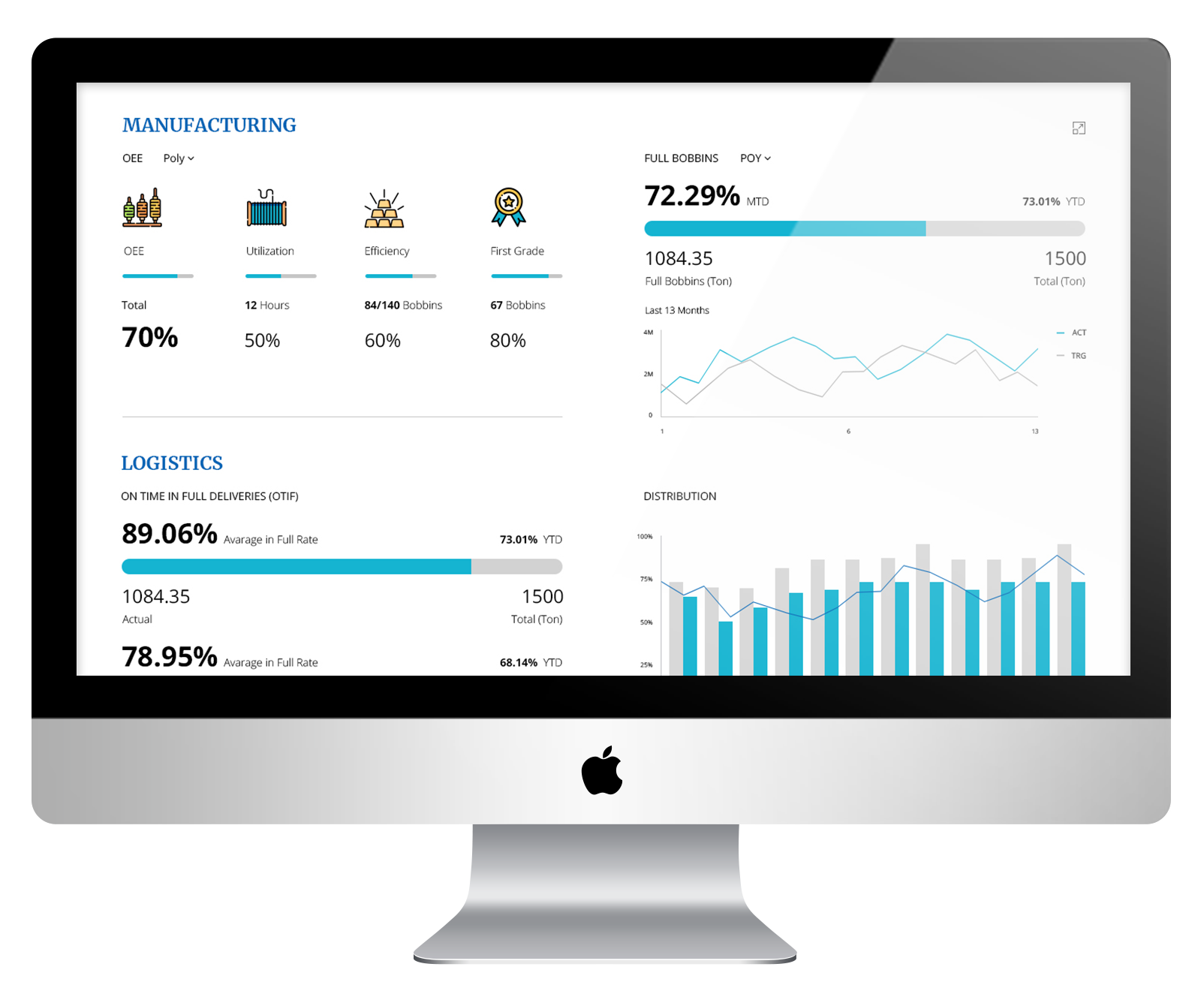
Every manufacturer knows what OEE (Overall Equipment Effectiveness) means and stands for. It is very easy to create a visualization for it, but it is also very easy to get lost in vague generalities. I chose to use icons because I love them. I love them because when used correctly, they elaborate anything, whether it’s a headline hawking the expertise of a professional or an entire page with further information about his or her work.
This is why I decided to use icons on this design: they give users a break from the numbers and graphic objects, allowing them to absorb the information in a lighter way. They also immediately attract the eye and cannot be ignored, so it’s a win-win.
Every business intelligence project includes a large amount of information that needs to be arranged on a small area. This project was remarkable for three reasons:
1. The amount of information was much greater than usual, and our designs altered significantly across a long series of sketches.
2. We had more creative freedom because we were not limited to one system. It made the process more pleasant, but we had to work closely with the developers to make sure that every idea was applicable.
3. The system was complex from the very beginning, and it was very important not to overload it.
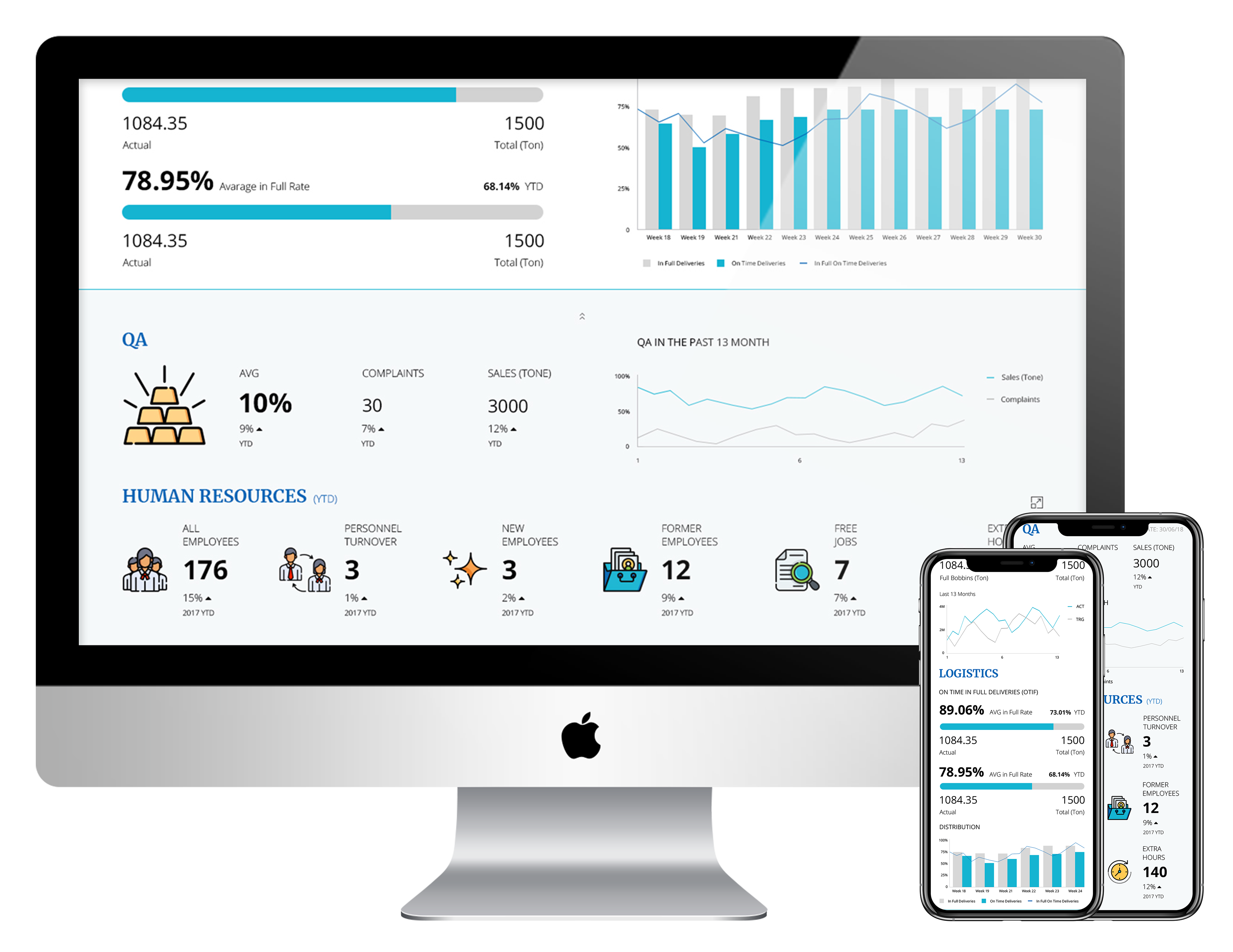
As a result, we had to consider the model as a symbiotic unit, and not simply divide it into independent sections. It was a very interesting, for that, because it made us reexamine our sketches every time. This way we could track and monitor changes in the model, and eventually reach a complete, balanced product—where my design served every client request perfectly.